JanuzFlow Studio Site
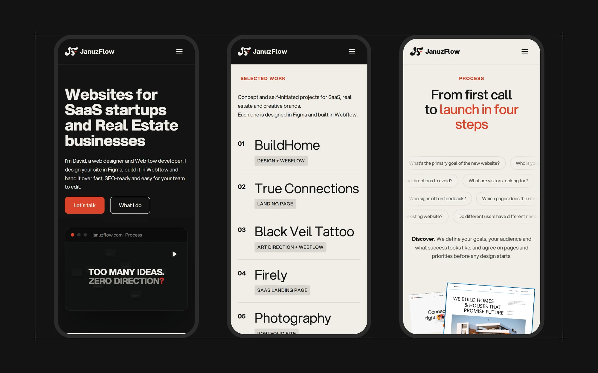
The site you’re on: a studio website designed and built to prove the process it sells.

A studio website is the one project where there’s no client to blame. The JanuzFlow site had to explain what the studio does in one line, show the work fast, and behave like the sites it promises to build: quick, accessible and easy to update.
The challenge
Portfolio sites often win design awards and lose visitors — heavy animation, slow loading and no clear next step. The goal was the opposite trade-off: a strong, recognisable look, motion that supports reading instead of delaying it, and a contact path that is never more than one click away.
The approach
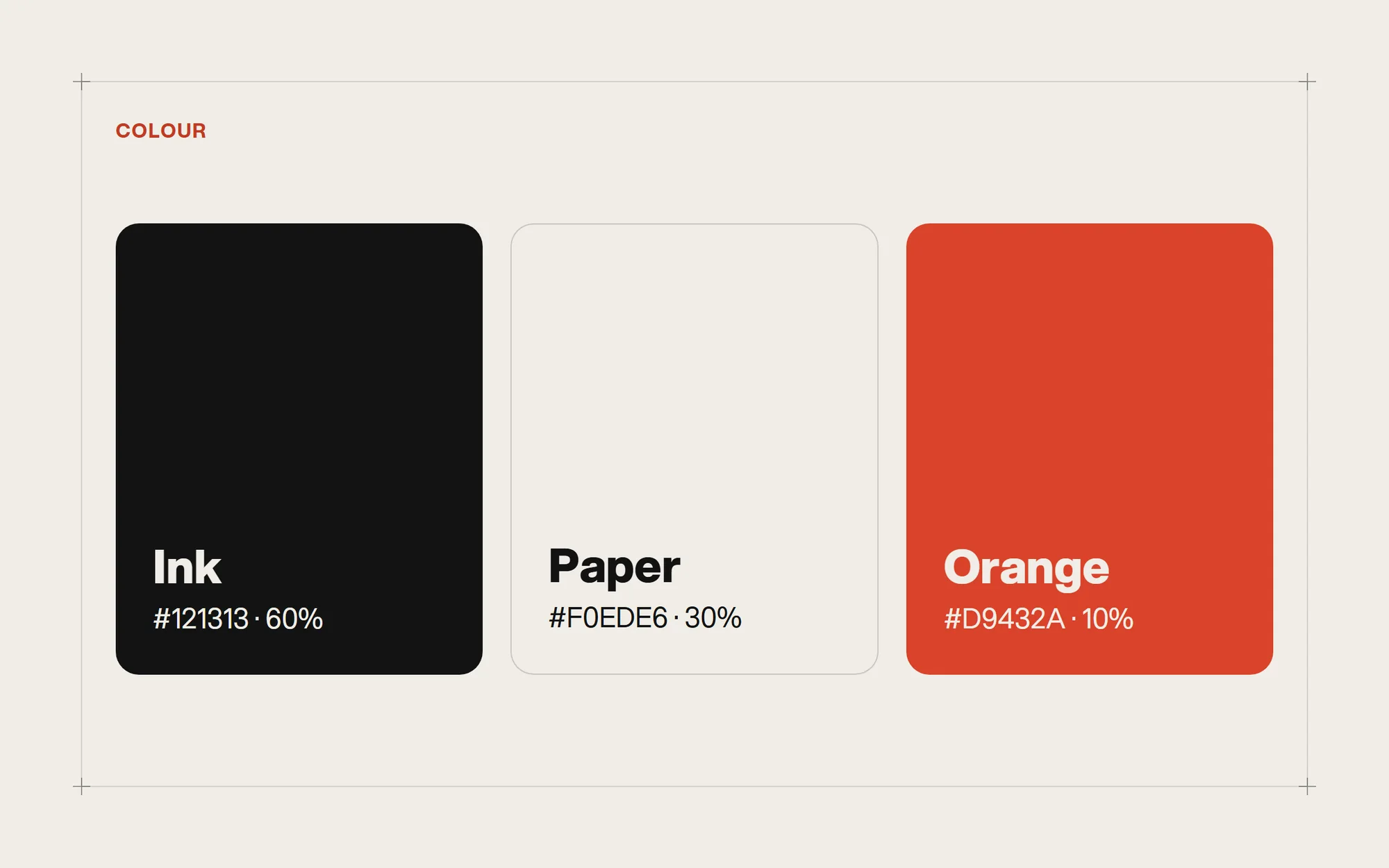
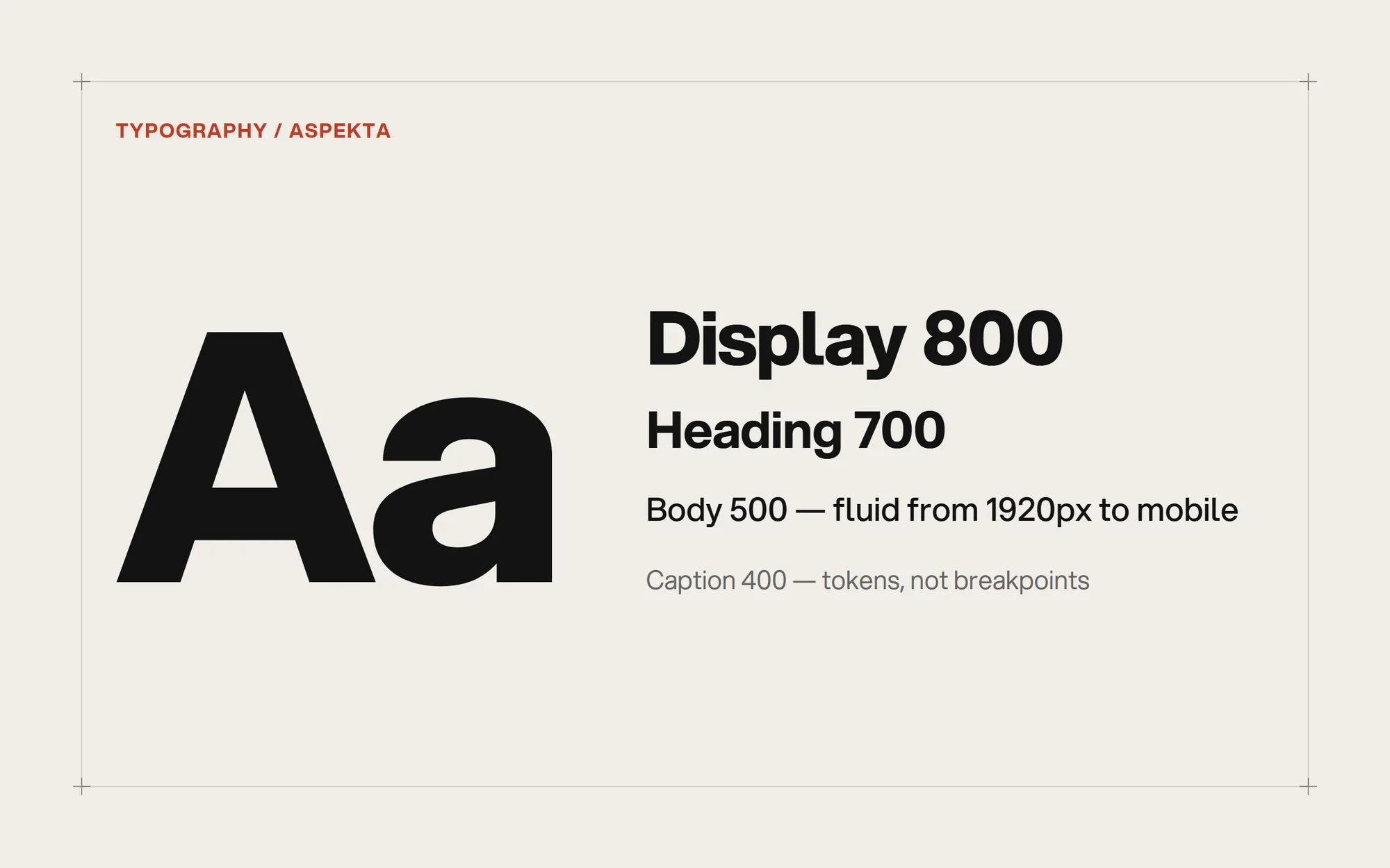
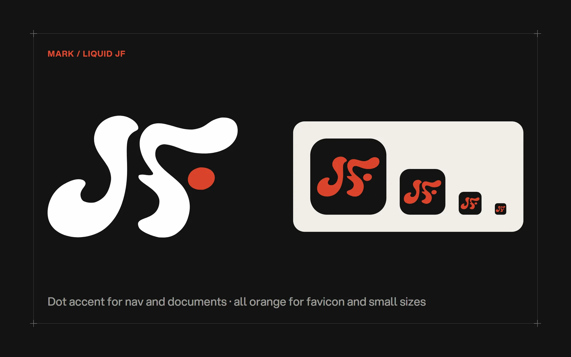
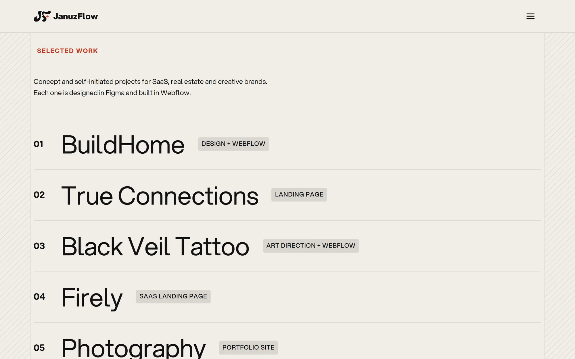
The identity is deliberately small: a liquid JF monogram next to an Aspekta wordmark, three colours — ink black, warm paper and a single orange accent kept to about a tenth of any screen — and a fine architectural grid that runs through every section. The monogram has a dot-accent version for the nav and documents, and an all-orange version for the favicon and anything under 48px. Type and spacing are fluid tokens, so they scale smoothly between 1920px and mobile without extra breakpoints.
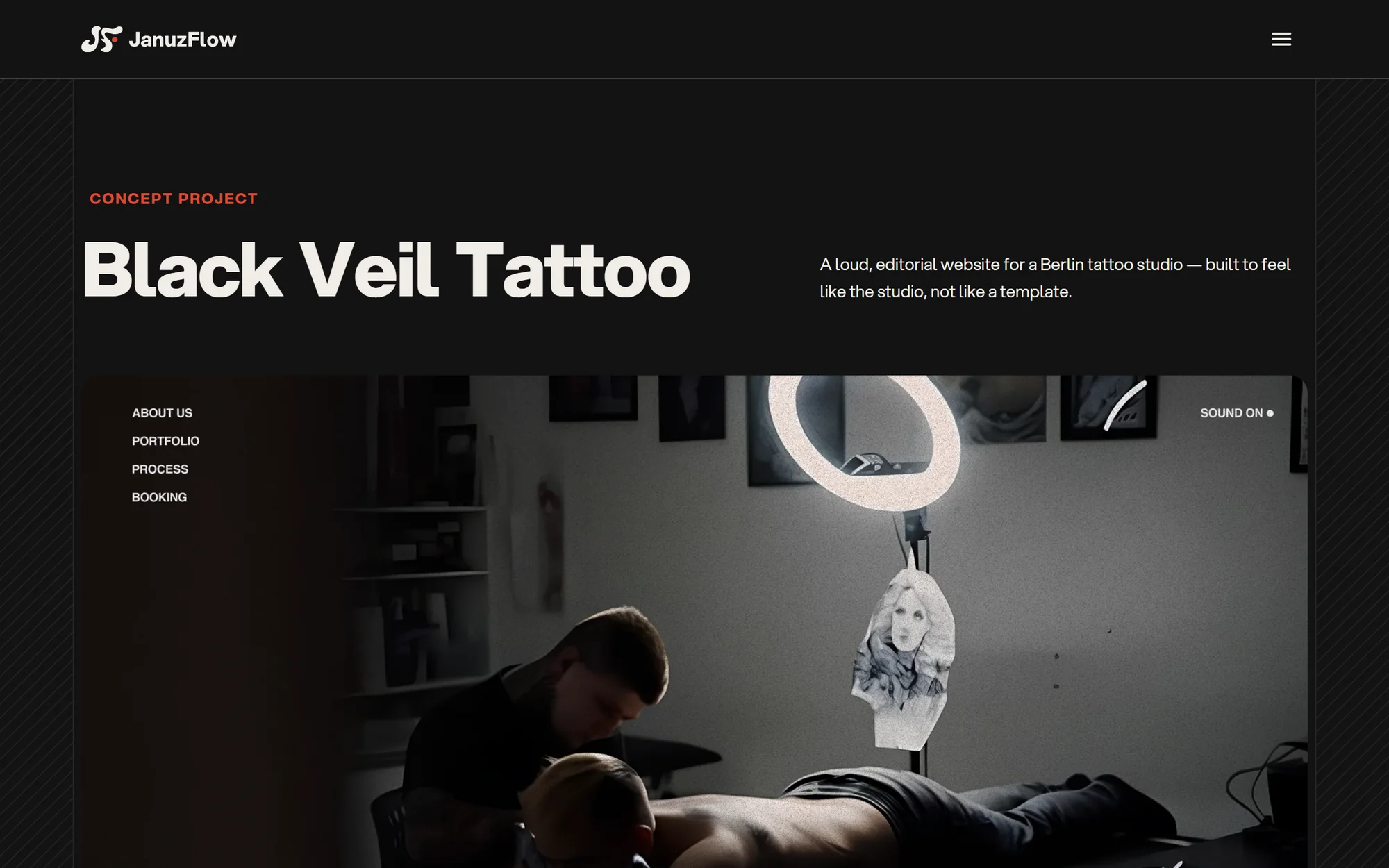
The Webflow build follows Client-First naming, uses components for every global element and a CMS for projects. Motion is custom code: GSAP text reveals, Lenis smooth scrolling, wave page transitions, a cursor-following project preview and a preloader that only plays on the first visit. All animation respects reduced-motion settings, and cookie consent is a real opt-in, not a banner that does nothing.
The outcome
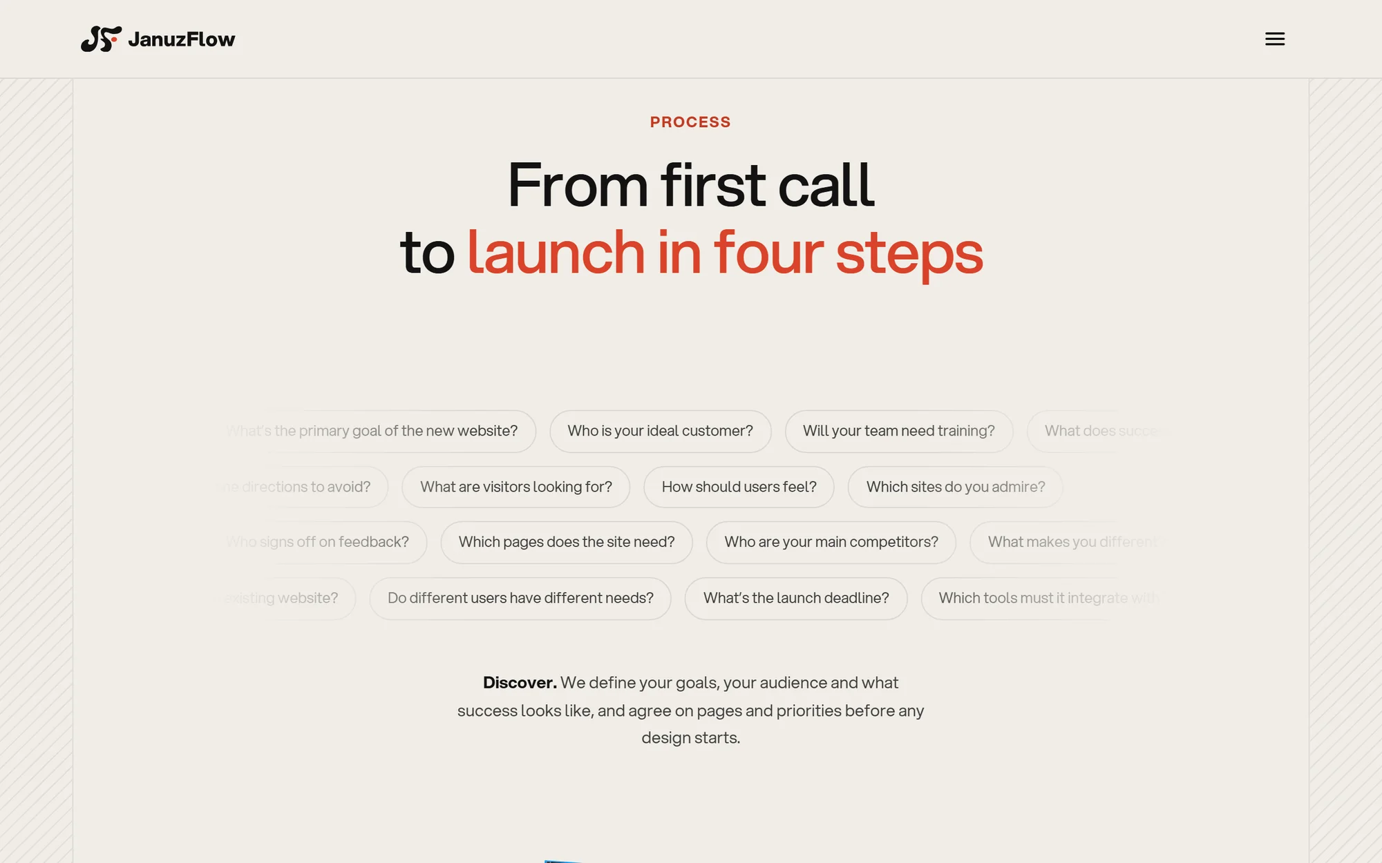
A fast, fully responsive studio site that can be maintained without a developer — new case studies are just a new CMS item. It’s also the clearest demonstration of how JanuzFlow works: design system first, then a clean build.
Lighthouse scores
Measured on the live site with Google Lighthouse (mobile).
Want a site like this for your brand?
Book a free 30-minute discovery call. You’ll talk directly to the person who designs and builds your site.